
Incident and reflected light
Colors of objects, living things, etc. are different from the colors we see e.g. on your home TV screen or smartphone. The former are reflected from the pigmented surface, while the latter radiate directly into our eye. These are quite different principles. The first consists of three colors: red, blue and yellow. By mixing all these colors we get all the other shades, but using all the colors at once results in black because the pigments have absorbed the entire spectrum and there is no reflected light to enter our eye. Everyone encountered this as a child when painting with tempera paints
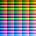
On the other hand, with incident light, the RGB room rule applies - there all shades are achieved with the intensity of red, green and blue. Using all colors evenly results in white light. For example, if you take a magnifying glass and bring it closer to a WHITE screen (TV, computer, phone,...) you will notice clusters of red, blue and green pixels that work from a distance - white. The intensity of each pixel determines the final color perceived by the eyes and brain.
Colors and shades in print
Even with print reproductions, we would like to achieve an economically advantageous system for simulating the entire color palette - that is, by mixing a few basic colors. So let's use dots of different colors that reflect light into our eye and if they are small enough, the eye combines them into a "third" color, just like with a screen. It was developed for the needs of process printing (most printed materials, magazines, prospectuses, books...). CMYK standard – Cyan (blue), Magenta (red pink), Yellow (yellow) and K (black color). The latter is intended for additional contrast and blackness, which cannot be achieved by mixing CMY alone.
All other shades are simulated by the size of these dots, which are arranged in a raster. You can also easily see this with the help of a magnifying glass, which you bring closer to a printed multi-color publication. The system is fairly simple and enables fast and relatively inexpensive reproduction. As a result, it is by far the most widely used standard worldwide.
Unfortunately, using this system does not give us ideal results in some situations. In particular, some very vivid colors are reduced, such as bright green and especially orange (we do not have these problems with the incident light emitted by the screen). Where the demand for as faithful a reproduction as possible is very high, in addition to CMYK, additional colors can also be used, which makes the printing itself quite complicated and expensive, and in addition, such printing also requires special machines.
Of course, the perception of the printed color is also largely influenced by the material on which we print. The color must be as white as possible for good reproduction, and the structure of the material is also important. Matte surfaces will give us a more muted and less contrasting image than smooth and shiny ones.


