Proper use of images for a website

Each website also contains image material. Be it photos or graphics. They are mostly in formats such as JPG, PNG, BMP, ... some also in SVG (more on that later)

The content of the image material is, of course, arbitrary depending on the topic or purpose and is a matter of free choice. It is different with the other parameters, such as resolution, color space, dimensions... in order to avoid problems or unnecessary ill will, it is necessary to consider some repairs, which I will try to outline in this article.


Resolution

Resolutions or dimensions are measured in pixels (px). This is the number of dots that make up the image. So if I have a 1980px wide screen, the 1980px image will stretch from edge to edge of the screen in its native resolution. Well, unfortunately (or fortunately) not all users have the same screen size, so in some places the image will look bigger on the screen, and in others it will be smaller. Most of the platforms where we design and set up websites (for example, wordpress) allow you to choose the size according to the need or intended format. The image can therefore be forcibly enlarged or reduced. With the latter, the image will look OK, but with the first option (enlargement), it will probably be more or less "soft" or not sharp, because the display exceeds the natural resolution. It is therefore important to have sufficiently large images available. We can still reduce them.
Thus, for an average screen, it is wise to choose a cover image that should cover the entire screen (left-right) by at least 1500 px, so that there is no too severe loss of quality. On the other hand, we need smaller dimensions for the products in the online store, otherwise 800-1000 px is a perfectly satisfactory resolution.

Even if web page creation systems are able to reduce the image to the appropriate size of the final display, we must not exaggerate the resolution. Most modern digital cameras or phones have a resolution of at least 4000px along the longest side, which is far too much for screen display. A larger image in the web database also means a larger file and therefore requires more space on the server. As a result, it will also load more slowly on the screen (more px - more Mb).


Dimensions - aspect ratios

This term does not mean the size as such, because we have already processed this in the previous paragraph, but rather the aspect ratio, which we must pay attention to. Example: we would like to have a banner on the entrance page that would vertically cover about 1/3 of the page. We do have a portrait photo available. What will happen? The system will do two things: If the image (in px) is too narrow, it will enlarge it and the result will be a blurry image. However, since the above-mentioned image is in the wrong aspect ratio - the banner is horizontal, the image is vertical - it will create a cutout, which does not necessarily contain what you want to show. Therefore, it is necessary to crop the image, adjust it, choose according to our needs and adhere to the height-width ratio. This is the only way we will get the correct result.

The same applies to product images in the online store. Most systems allow the display of a square image, which is a kind of compromise, because with this we can display most products, both tall and wide. And so he circumcises them. Otherwise, you would have a real mess of portrait and landscape images in the online store, which would be opaque and ugly. But since differently positioned product images are a fact, a little intervention is needed here. It is best to crop all product images to this – square dimension. You can also do this in the wordpress gallery, but the process is a bit clumsy and time-consuming. If you have at least a little knowledge and would like a little more control, you can use any photo editing program (photoshop, etc...). It is important that all images end up with the same dimensions. As these examples show:


Vertikalna slika izdelka     Neustrezen format slike izdelka

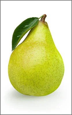
Inappropriate positioning or cropping of the product image.
If the image is vertical, the program will crop it to a square format and consequently cut the bottom and top. If the image is horizontal, the program will crop it left and right.


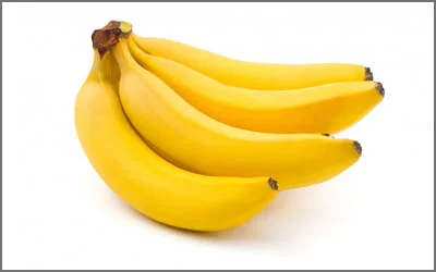
Properly prepared image of the product.
The program will not crop it and we will get a neat image grid of square images of products in the online store.


Colors

Since the screen recognizes only the RGB color space, it is very important that all images are in this color space. "grayscale" or "CMYK" images will not be displayed, or the online program will reject them when we try to upload them to the gallery.


Record mode or format

Most of the images or photos on the web pages are in bitmap format, which means that a dot in the image that indicates a certain color is also a dot on the screen. By enlarging the image, we get an increasingly blurred image, because the computer naturally does not know what is located between these adjacent dots in order to make an intermediate dot for better resolution. This applies to all bitmap files such as JPG, PNG, BMP, TIFF, ….

Of course, there is also a vector format for some graphics that can be used from a web page, and it is called SVG. First of all, let's explain to those of you who don't know what vector notation is. For example, if we want to display a red square in a bitmap file, it means that the computer will have to know the location and color value of each dot. If it is, for example, a square with dimensions of 1000 x 1000 px, this means one million dots, each of which also contains information about the color depth (24 bits per dot). This means a lot of information that the computer has to process in order to make the correct display on the screen. On the other hand, vector notation works on the basis of mathematical notation, which only determines position, size and color, and the display is then generated on the basis of these parameters. The file is of course much smaller and does not increase in size when enlarging the graphics. However, this notation is only useful for simpler graphics (logos, graphs, icons...). A photograph contains so much different information that it cannot be presented with mathematical formulas.


Conclusion

It is important to know some of the rules I described above in order to prepare the image material correctly. In this way, the display will be as we want, but at the same time we will not burden the server too much, because the opposite page will take too long to load.

THOMASWORKS

YES, I WOULD LIKE TO RECEIVE
BLOG CONTRIBUTIONS FROM THIS PAGE!